Jacques Pépin Foundation Annual Report
Designing an evergreen content model for a single-page annual report
Opportunity
As a emerging organization, the Jacques Pépin Foundation (JPF) is in the process of formalizing many of their official communications and information strategies. After releasing their initial annual report as a PDF, the Foundation decided they needed a more flexible and evergreen solution for this annual document.
Outcome
Working with the head of Membership, Partnerships and Engagement, I conceived, designed and built a dynamic, single-page site with a content model, layout and codebase that could be used as a template for future reports. Following the successful release of the initial site, the model was employed successfully the following year.
Content Model
When the project started, I was given a Word document and a folder of images. This is one of my favorite design projects — find patterns in the content, consider possible hierarchies and sectioning and then check the schema against current and potential future content. Following this assessment, we landed on a set of five categories and a set of subsections to organize the content. While the five categories have equal weight, in the main menu, we stylized “vision” and “impact” to highlight the Foundation's principles and results.
Vision
- Letter from ED
- Mission/Vision
- JP Bio
- Timeline
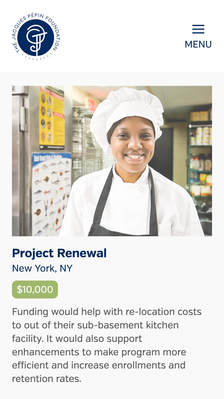
Impact
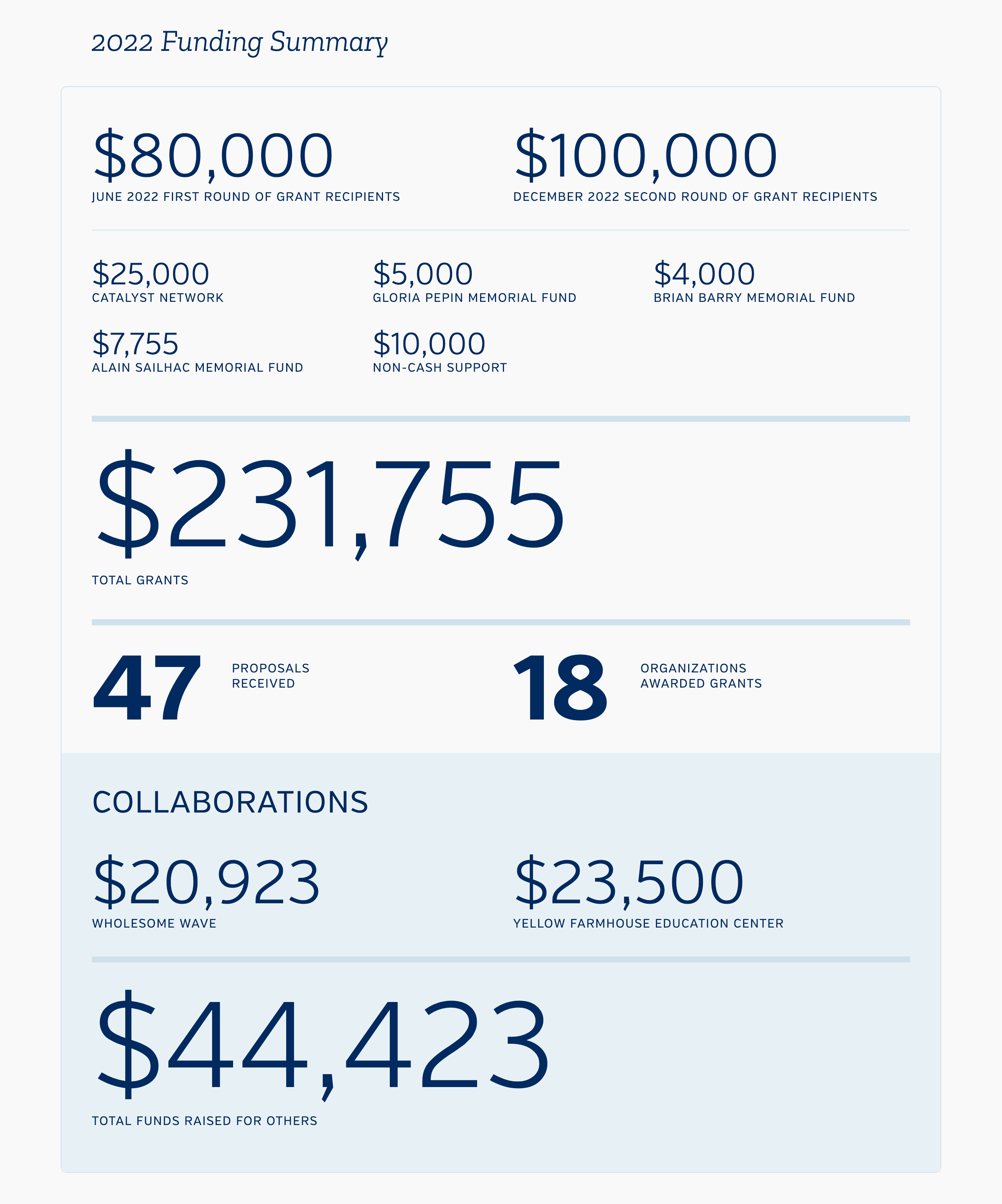
- Funding Summary
- Awardees
- Partnership Support
- Featured Partner
- Memorial Grant
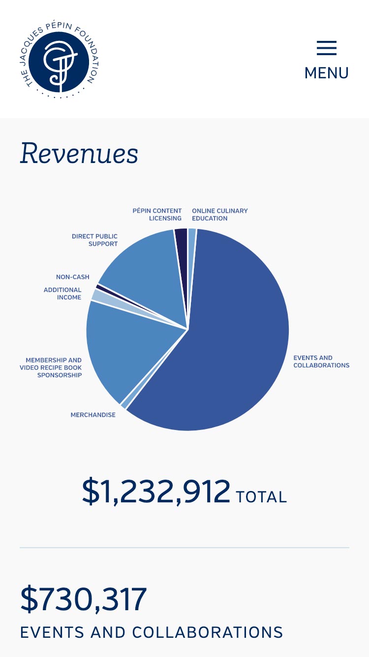
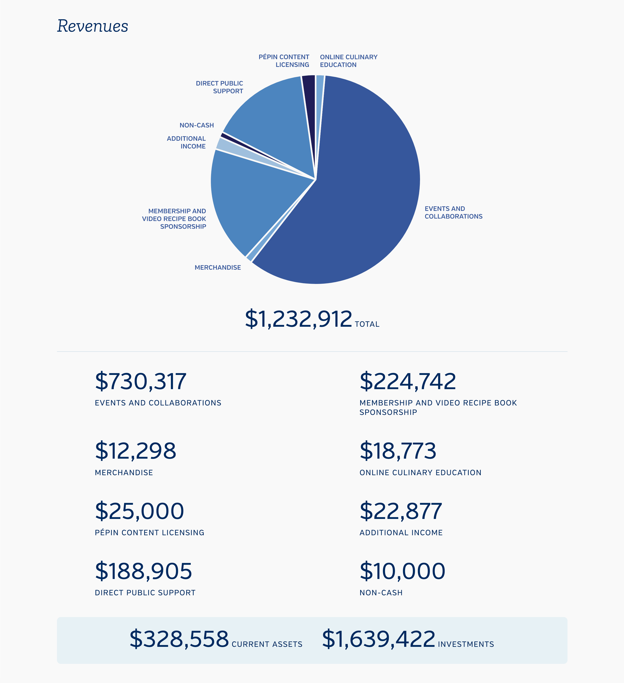
Financials
- Revenues
- Revenue Generation
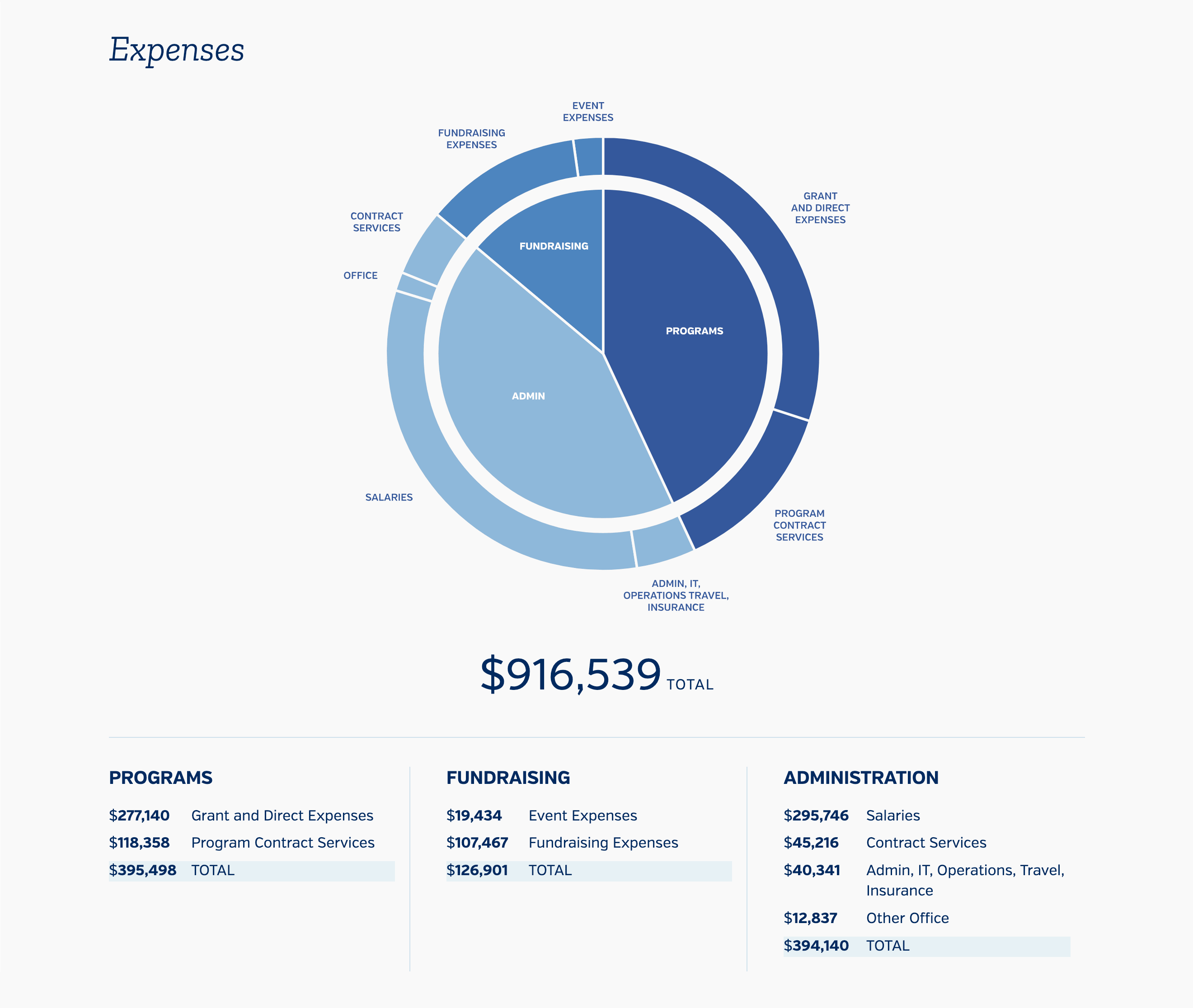
- Expenses
- Programs and Expenses
People
- Executives, Board and Team
Partners
- Partnership Recognitions

Navigation
To keep the emphasis on the content of the report, the main menu was tucked away in a left sidebar drawer. While the five categories have equal weight, in the main menu, we stylized “vision” and “impact” to highlight the mission and effectiveness of the foundation.
Interaction cues are provided in the form of a hover state on the sidebar menu and an icon change when the menu drawer is opened.
Interaction Design
Given the constraint of a one page design, I began by focusing on how to manage the user's attention as they scrolled the page. Clear way-finding in the form of prominent section markers and subtle animation cues help telegraph this and result in an easy to follow experience.
Alternating column grid designs with sticky image anchors provide visual changes that signal the start and end of content blocks.
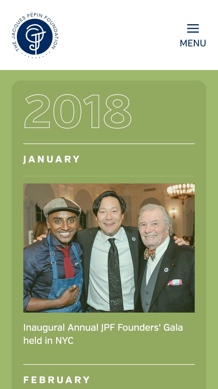
Timeline
To call attention to the Foundation's accomplishments in its early stages, I built an interface with bento-style layout and jump navigation to let users navigate to milestone moments.
Early years have fewer events. Later years have more. The bento-style layout is used to provide small blocks for early years and larger, multi-column blocks for later ones.
Charts and Graphs
I implemented responsive CSS grid layouts and custom scalable vector graphics to present accounting data and tables legibly across a variety of screen sizes.
Responsive Layout
Over half of the primary JPF site traffic comes from mobile devices. Accordingly, each detail of the microsite has been optimized for both small and wide screen displays.