Studio C Architects
A flexible development plan for a dynamic site design
Opportunity
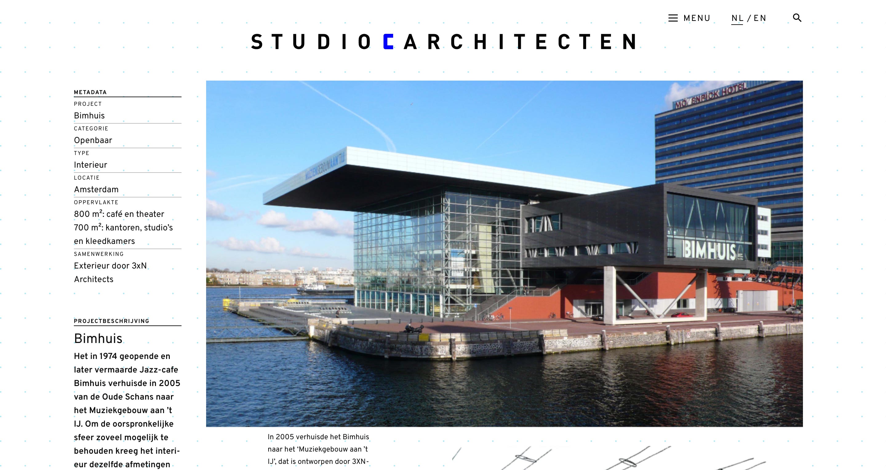
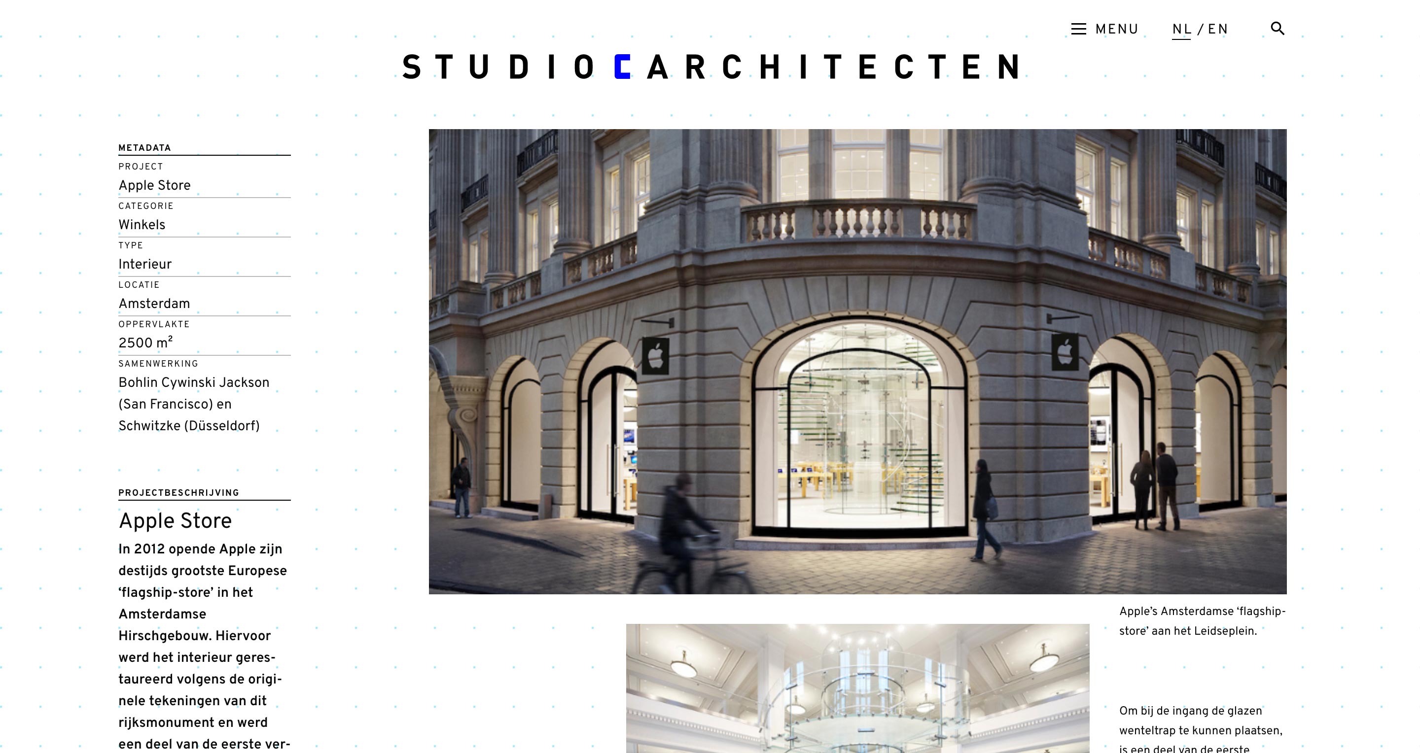
This project involved coding, testing and launching a responsive website for a Netherlands-based Architecture firm. The design prototype was provided. The primary development challenges involved coding a set of 11 distinct, brutalist-style, case study layouts (each with three breakpoints), coding an intricate, animated project index, implementing the site content in two languages and structuring the templates for easy editing by the client.
Outcome
The final site was realized using a combination of CSS animation for the project index and a custom PHP template system to share common components across pages and make it easier to craft pages for each language. In addition, Zurb Foundation was utilized for its organized grid layout system. The final site succeeds on all of these points.
Animated UI with CSS
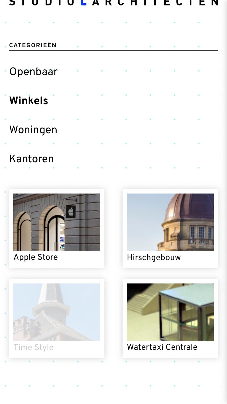
The design prototype for the project index called for each project card to be displayed at the end of a thin line. The line would animate across the page when the user clicked on the respective category link. An additional design concern was the precise layout of the respective cards and the stacking visibility of the respective lines.
The card lines were produced with CSS pseudo content — one for the line, another for the bullet at the end of the line. The animation was created with CSS transitions and CSS @keyframes.
Case Study Layout Grids
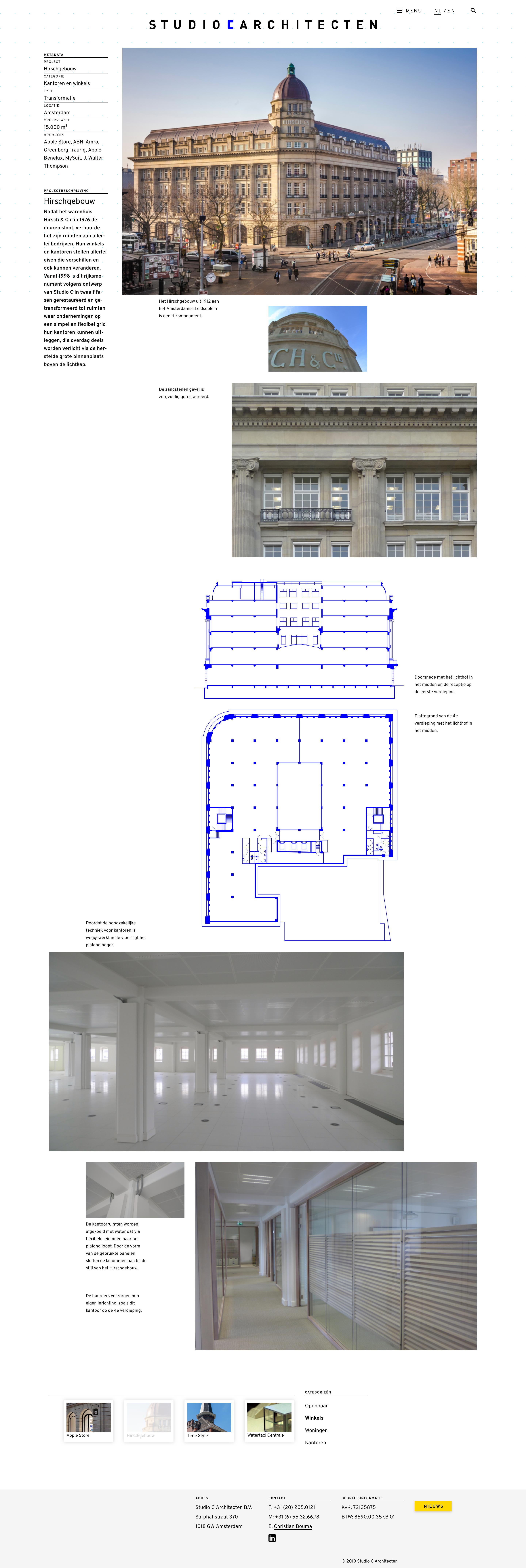
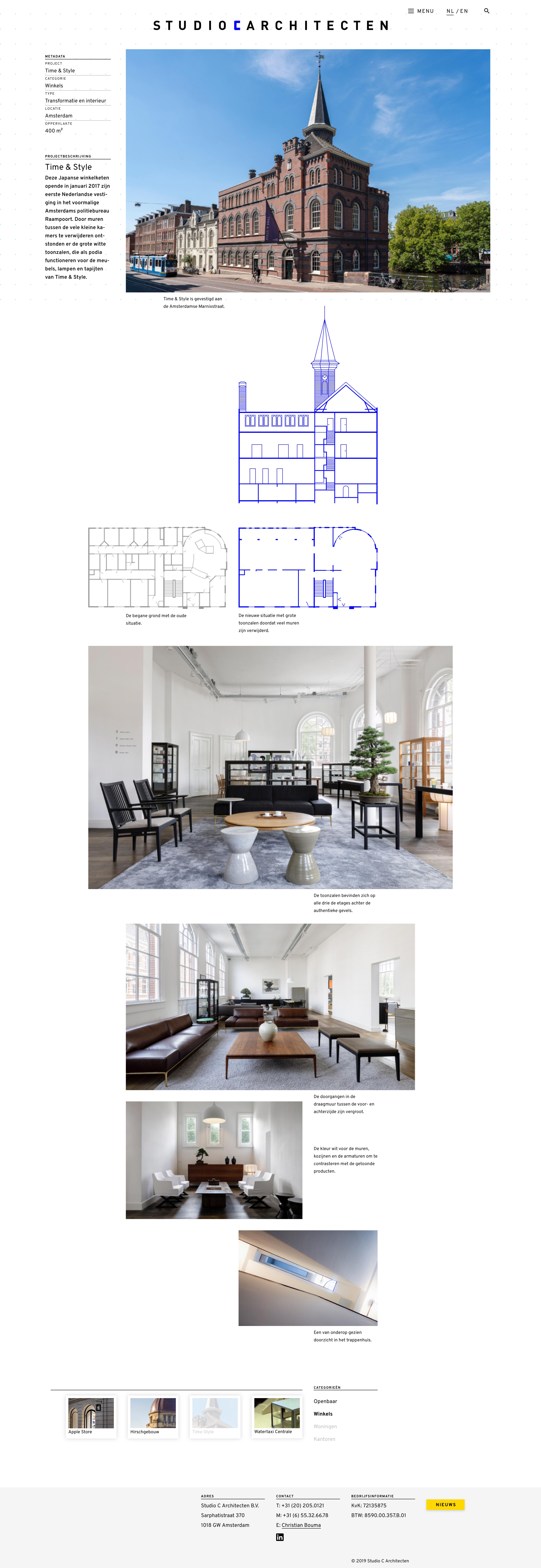
Each of the site's 11 case studies features a distinct, asymmetrical layout grid. The base grid for each layout was implemented using Zurb Foundation grid classes. Additional positioning, using common/regular spacing units, was handled with CSS margins.

Slideout Footer
The prototype design provided called for each inner page to end with a slideout footer containing the animated project index. Additional features on each case study page include a custom, multi-level dropdown menu and tab-based project navigation.
Responsive Layouts
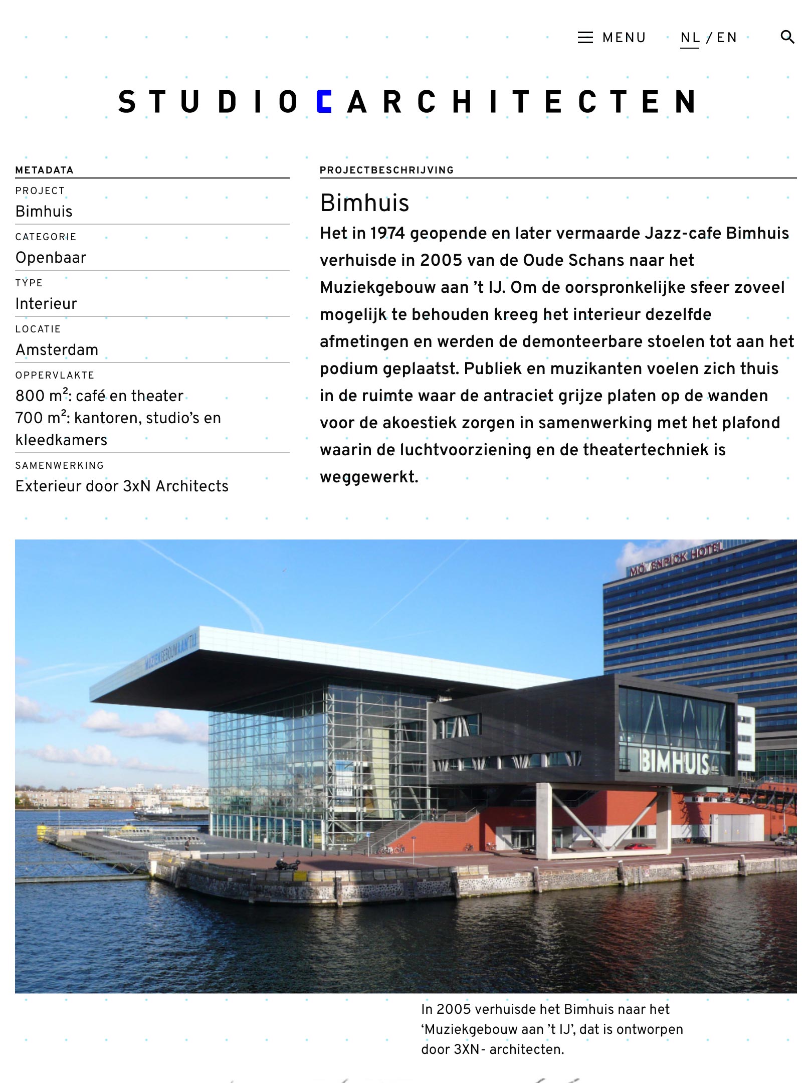
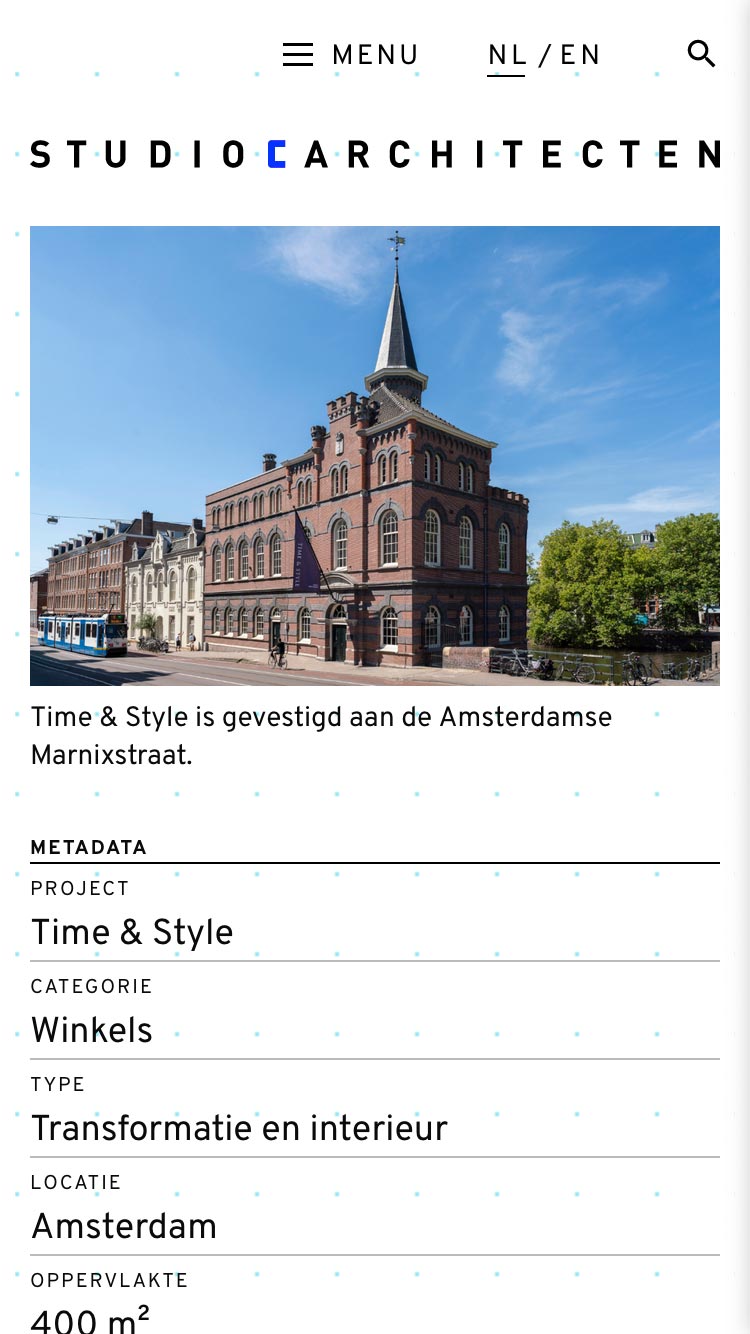
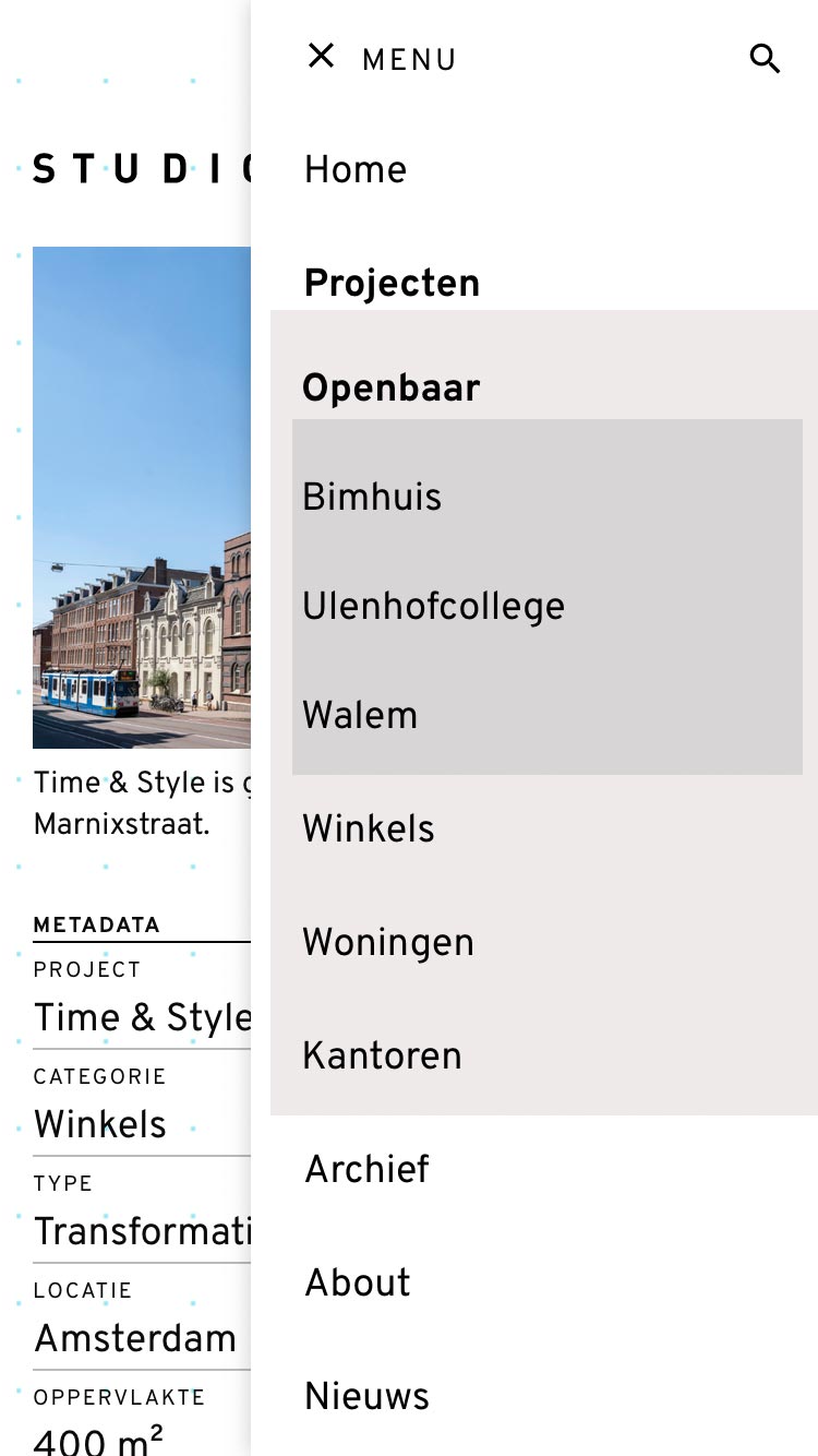
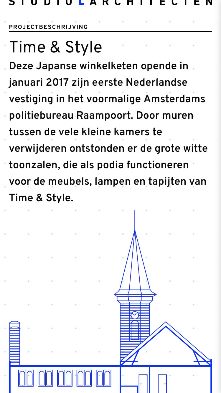
Each of the site's 11 case study layouts contain mobile, tablet and desktop variations. On mobile screens, the complex grids are collapsed into a single column. Foundation's Flexbox-based grid system, along with carefully constructed HTML markup, are used to rearrange the order of page elements for small screens.
Tablet-Friendly
The tablet layout also relied on carefully arranged HTML markup and Flexbox-based order properties.
