Stacy Karzen
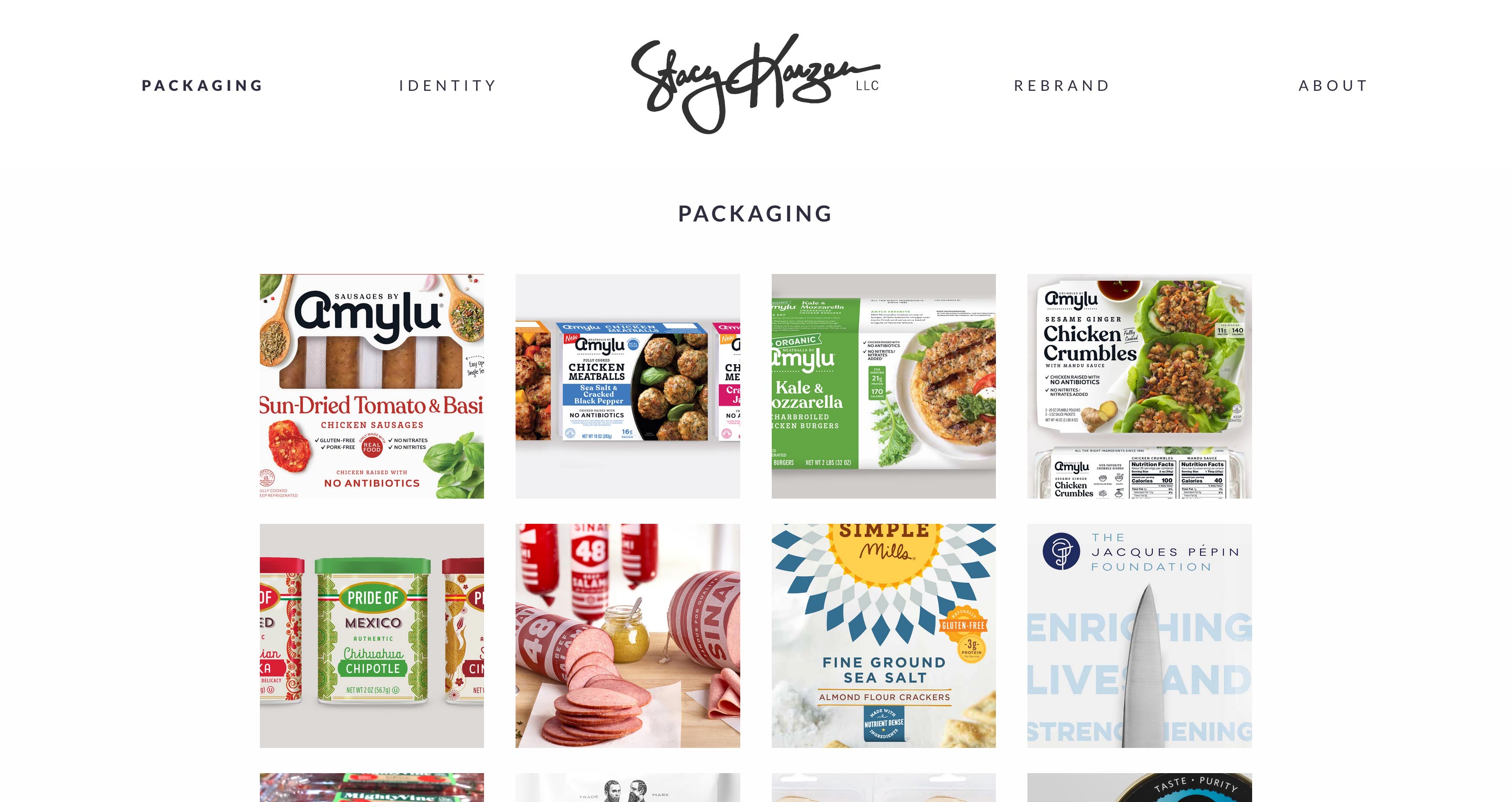
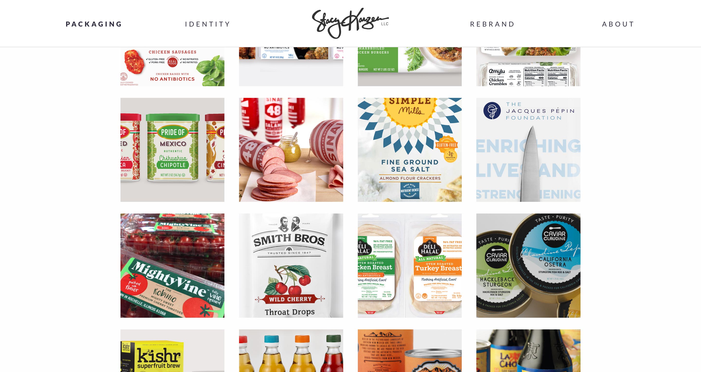
A spacious display for pristine packages and branding
Opportunity
Stacy Karzen is an award-winning graphic and package designer specializing in food and healthy food packaging and branding. Stacy needed a vehicle to feature her current work. The primary focus of the site would be on imagery — packages, logos and before and after shots illustrating the impact of her work.
Outcome
The design challenge for this assignment was keeping the attention on the products and not the interface. My approach focused on creating visual balance between the primary interface components and the images of the featured work. Whitespace was carefully considered to provide enough room for the packages and logos to breathe.
Overview
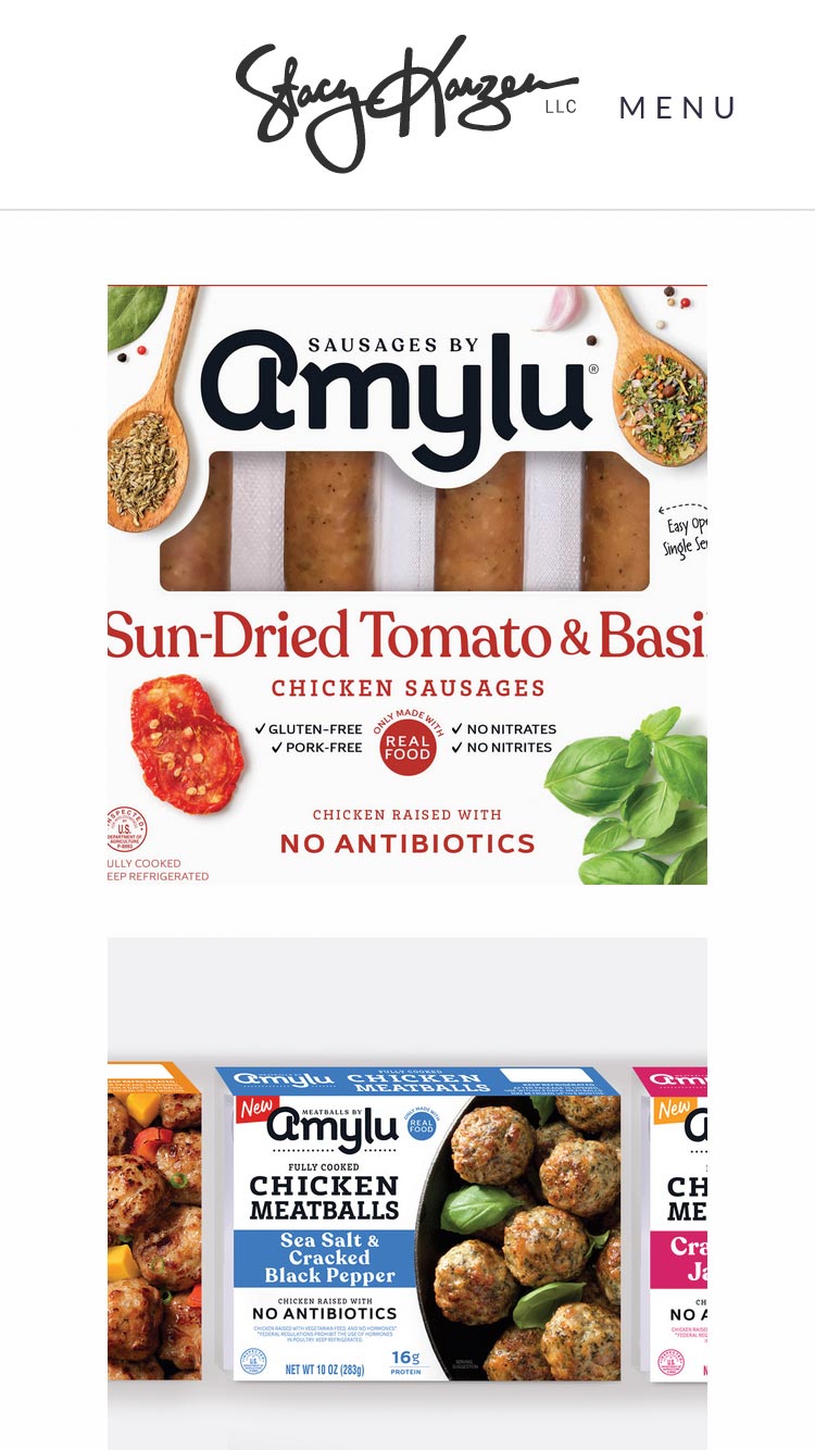
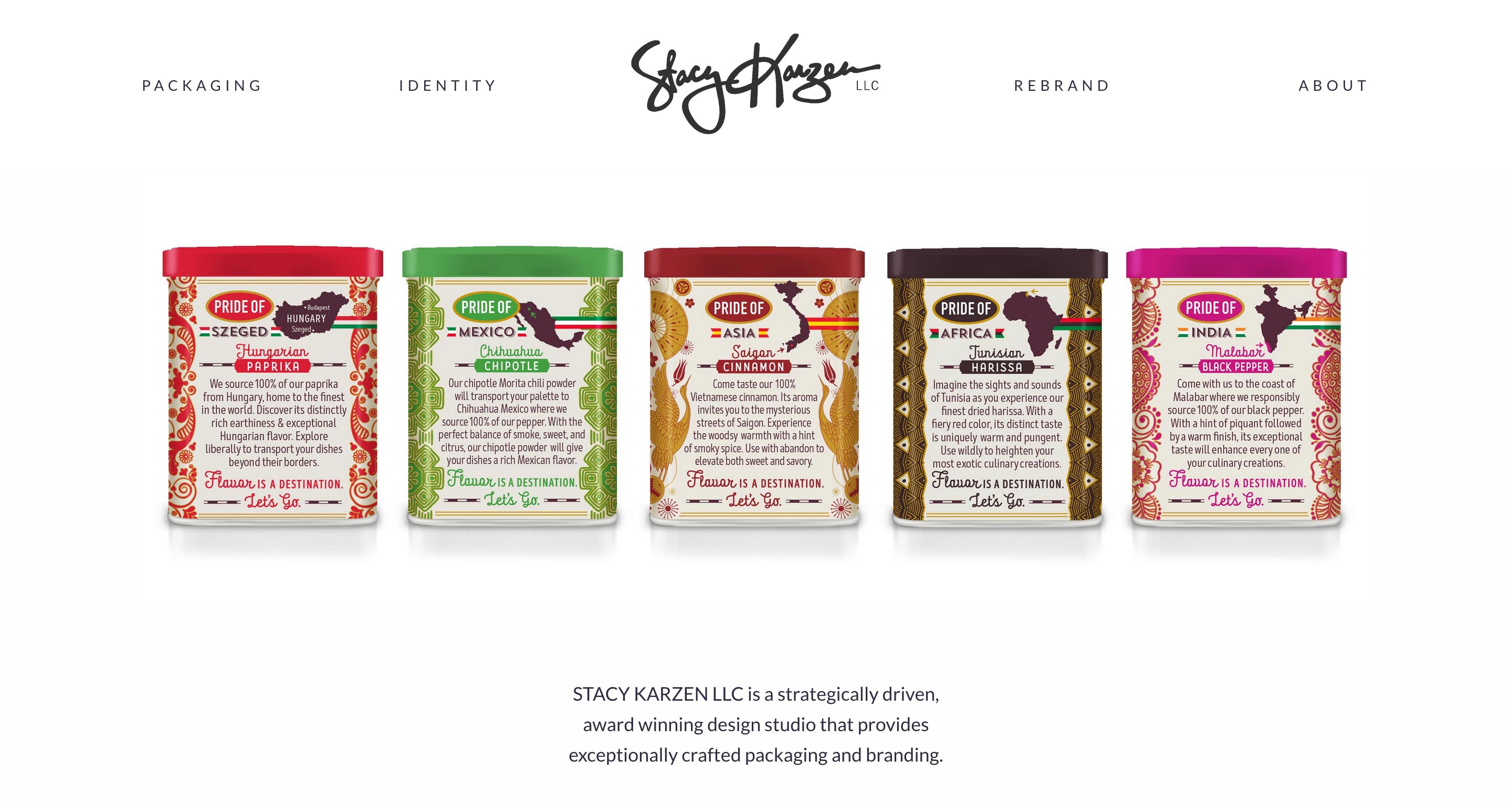
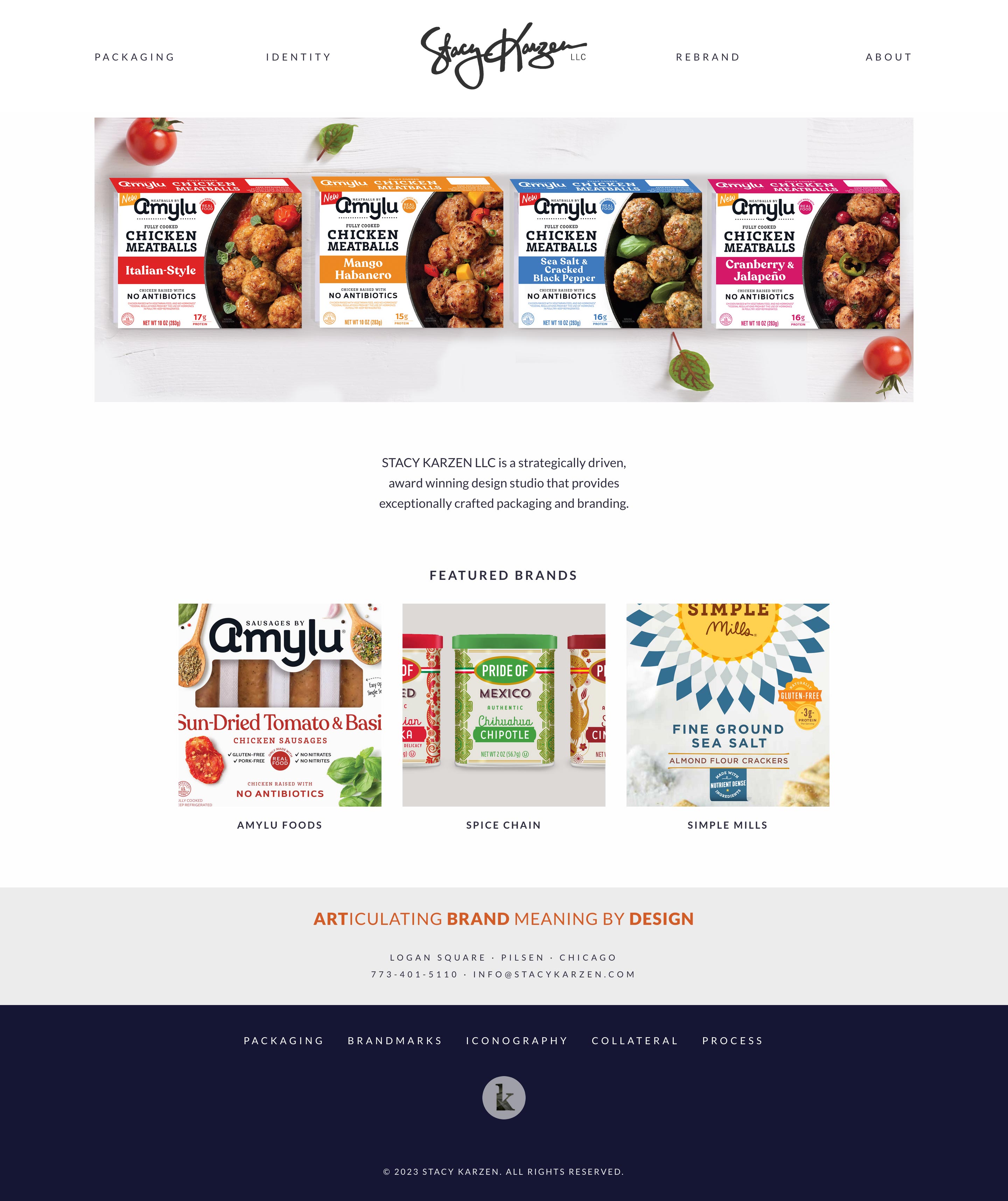
The Home page introduces the designer, samples of her work, featured brands and key messaging.
An Initial Splash
On the initial visit to the website, a splash screen displaying the client's branding is presented. This not only establishes the brand, it also provides a few moments for the home page images to load, improving the perceived performance of the site.
On a user's initial visit, the site stores a value in the browser's localStorage indicating the splash screen was shown. On future visits, it checks for that value to decide whether to show the splash again.
Making Space for Images
In an effort to preserve as much space as possible for images and grid layouts, I implemented a flexible header component that shrinks down in size as the user scrolls the page.
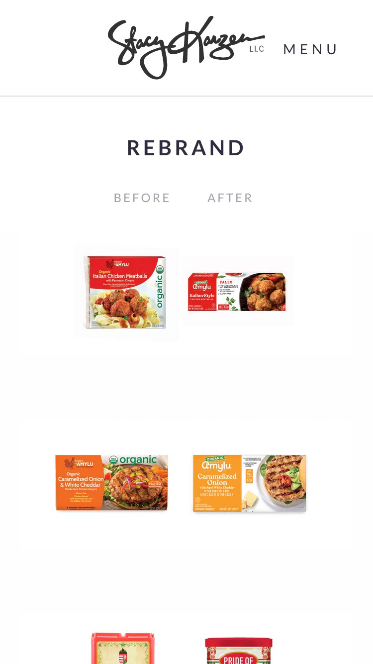
Compare and Contrast
The Rebrand page of the site communicates the value Stacy brings to each project. The side-by-side layout features the before and after designs, highlighting meaningful distinctions.
A sticky header is used to clearly caption the images in each before-and-after set as the user scrolls the page.
Responsive Layouts
Each of the site's layouts are optimized for mobile and desktop variations. On mobile screens, the product grids collapse into a single column.